Ponsonby: A Display Font Built for Digital Personality
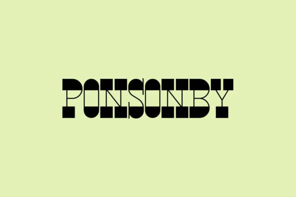
In the digital landscape, where interfaces often default to clean minimalism, a distinctive typographic voice can be your most powerful brand asset. Enter Ponsonby, a display font that breaks the mold with its fun and whimsical character. As a designer, I'm drawn to fonts that perform—those that don’t just look interesting in a font catalog but actively elevate a digital experience. Ponsonby’s unusual combination of thick and thin lines isn't merely decorative; it's a tool for injecting controlled playfulness into otherwise sterile layouts.
The Visual Mechanics of Ponsonby
Understanding a font's construction is key to deploying it effectively. Ponsonby is defined by its contrasting stroke weights. This creates a rhythm that feels energetic and lighthearted, yet it maintains enough structural consistency to ensure legibility at larger sizes. The personality is clear: it's friendly, approachable, and confidently unconventional. This makes it an ideal candidate for brands or projects that want to stand out without resorting to overly casual script fonts or generic bold sans-serifs. In digital spaces, this visual character translates directly to brand tone.
Strategic Applications in Web & UI Design
Display fonts like Ponsonby are not for body copy. Their strength lies in creating focal points and establishing hierarchy. Here’s how you can leverage it across digital projects.
Hero Sections & Landing Page Headlines
The first impression is critical. Using Ponsonby for your primary headline on a landing page or website hero section immediately sets a creative, engaging tone. For a creative portfolio, a boutique online store selling unique goods, or a coaching website centered on personal growth, this font can make your value proposition feel more human and inviting. It draws the eye and encourages scanning.
Call-to-Action Accents & Button Text
While not suitable for small button labels due to its detailed strokes, Ponsonby can be powerfully used for the main call-to-action phrase itself, perhaps in a larger banner above a simpler button. For instance, a phrase like “Start Your Creative Journey” in Ponsonby, paired with a plain “Sign Up” button in a robust sans-serif, creates a compelling visual hierarchy that guides users toward conversion.
Branded Content & Digital Advertising
Consistency builds trust. Using Ponsonby consistently across your blog post graphics, email header banners, social media ad visuals, and course sales page titles reinforces a cohesive online identity. This repetition turns a distinctive font into a recognizable brand signal. For a SaaS product targeting creative entrepreneurs, using Ponsonby in feature section headings can make the interface feel more aligned with its audience’s mindset.
Readability & Responsive Considerations
Any decorative font demands careful testing in real layouts.
- Size is Paramount: Ponsonby needs room to breathe. Use it at sizes typically above 36px for desktop, and ensure it scales appropriately on mobile, potentially needing even larger point sizes on smaller screens to maintain its detail and legibility.
- Background Contrast: The thin lines require high-contrast backgrounds. Avoid using it over busy imagery or low-contrast color combinations. Test it thoroughly on both light and dark modes if your site supports them.
- Spacing: Ample letter-spacing can enhance readability at larger sizes, especially when used in shorter phrases or single words for logos or navigational accents.
Its application is best limited to headlines, short titles, and decorative text blocks. Avoid using it for any navigational menu items, form labels, or paragraph text.
Building a Cohesive System with Font Pairing
A display font shines when supported by a utilitarian partner. Ponsonby’s playful nature is perfectly balanced by a clean, neutral sans-serif for all body copy, UI elements, and captions. Think of fonts like Inter, Roboto, or system fonts. This pairing creates a clear typographic hierarchy: Ponsonby for attention and emotion, the sans-serif for information and clarity.
For a more editorial or refined digital identity, pairing it with a classic serif font for longer introductory paragraphs could also work, establishing a sophisticated contrast. The rule is simple: let Ponsonby be the personality, and choose a partner that handles the heavy lifting of readability.
Practical Licensing for Digital Creators
As a font categorized under Freebies, it’s essential to verify its specific license. Many free fonts are free for personal and commercial use, including web implementation. Before embedding Ponsonby in a client’s website, online store, or digital product templates, confirm the license allows for:
- Commercial web use (embedding as a webfont).
- Use in client projects and brand assets you create for others.
- Distribution within digital templates or themes.
Always check for included file formats. For web use, you'll need to ensure you can convert it to common webfont formats (WOFF, WOFF2) or that such formats are provided. Also, inspect its glyph set for multilingual support if your project requires it.
Integrating Ponsonby into Your Workflow
Start by using it in a single, high-impact area. Perhaps redesign your portfolio site’s main headline. Observe how it affects the perceived professionalism and brand voice. Does it align with the project’s goals? Then, systematically apply it to other headline elements, ensuring consistency. This font is a commitment to a specific tone—one of creative confidence and friendly distinction. In a world of default interfaces, that commitment can be the very thing that makes your digital presence memorable, engaging, and uniquely yours.